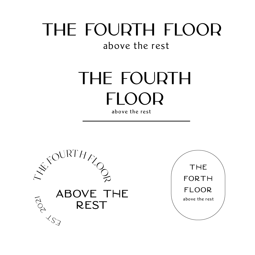
A miniature brief to help challenge my brand identity skills and to explore more relevant environmental ideas and concepts. Fourth Floor is a restaurant and bar that required a new logo and menu design.
Logo Exploration
As the name of the bar was 'the fourth floor' I wanted to capture this in their logo. I felt two wine glasses were appropriate due to the fact that they double up as a bar, with the stairs heading down to mimic the pouring of wine. I included a few vertical lines in between the glasses that imitate an arrow to show that the fourth floor is above the rest.

Type Choices
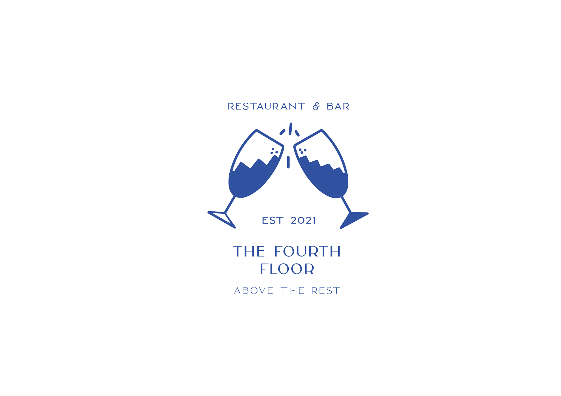
Main Logo
