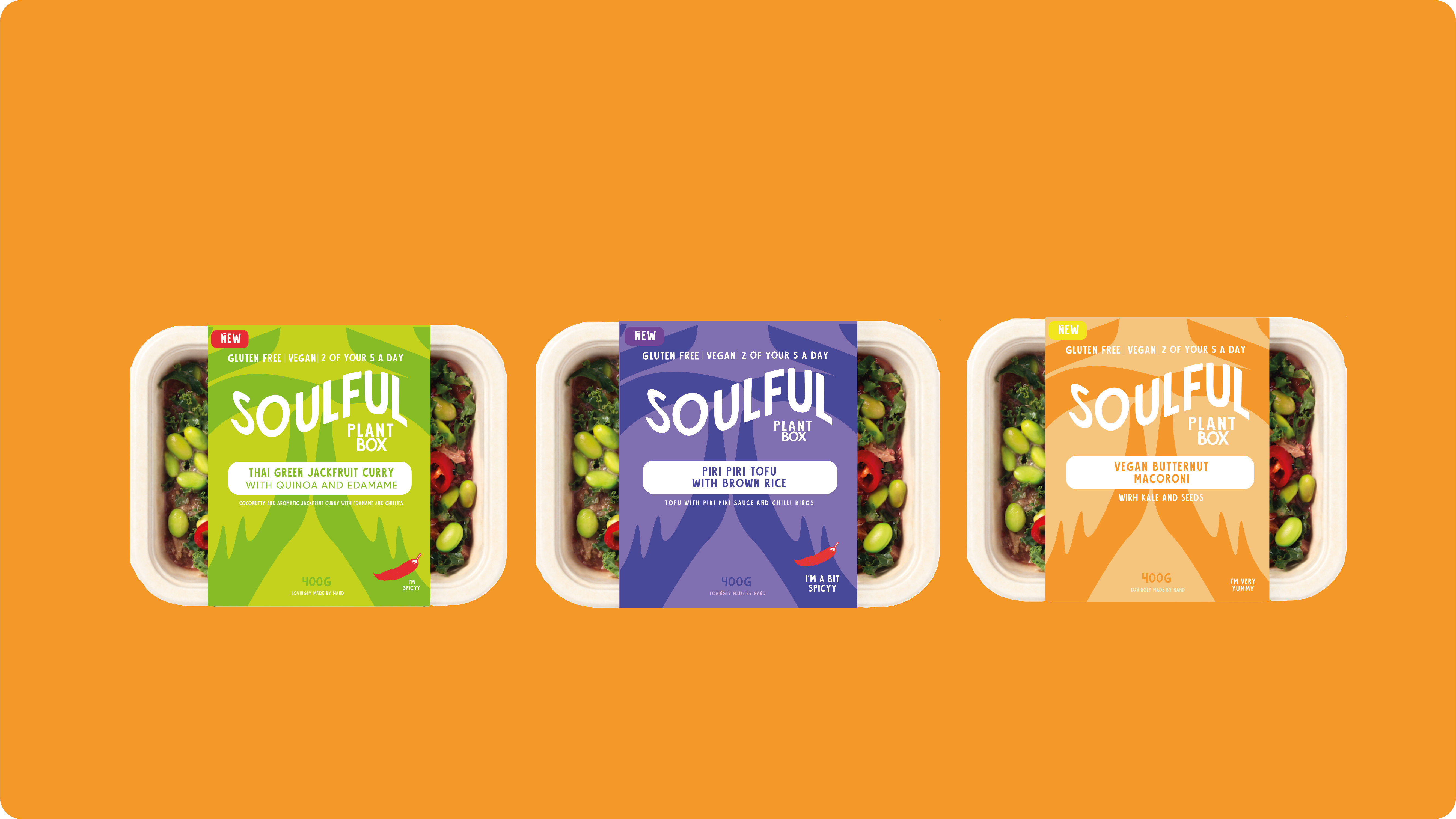
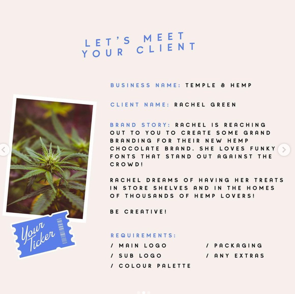
A hemp chocolate brand that needed a complete brand identity. The client loved funky fonts that stood out against the crowd and dreamt of having her treats in local stores and in the homes of countless Hemp Lovers. The client required a whole set of branding elements, from a new logo to packaging designs.
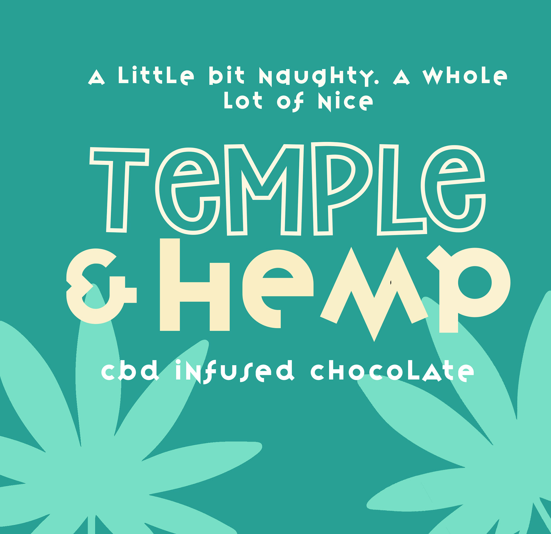
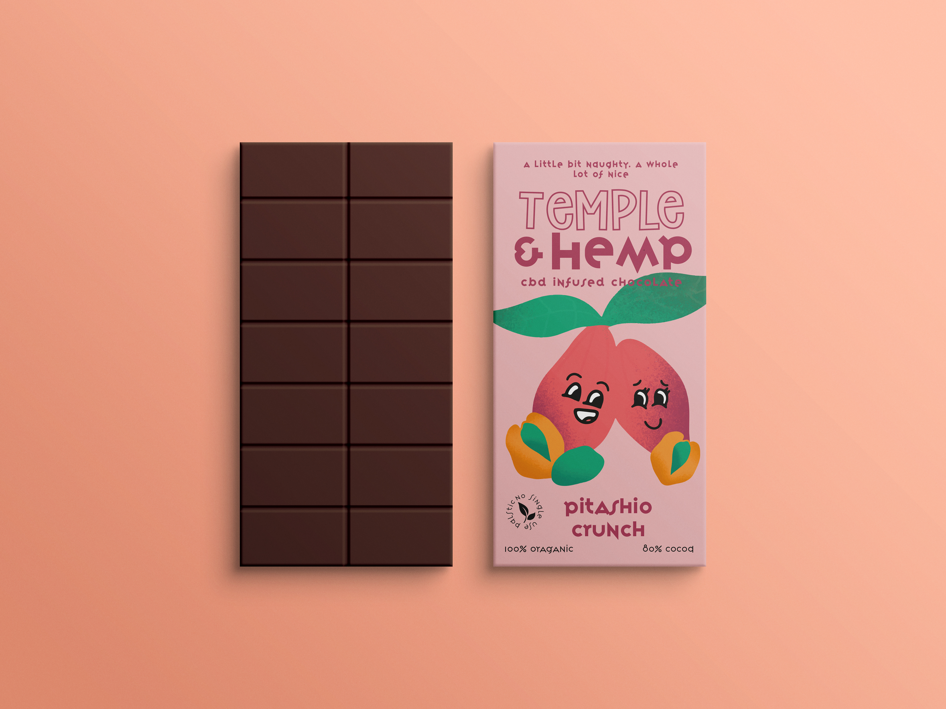
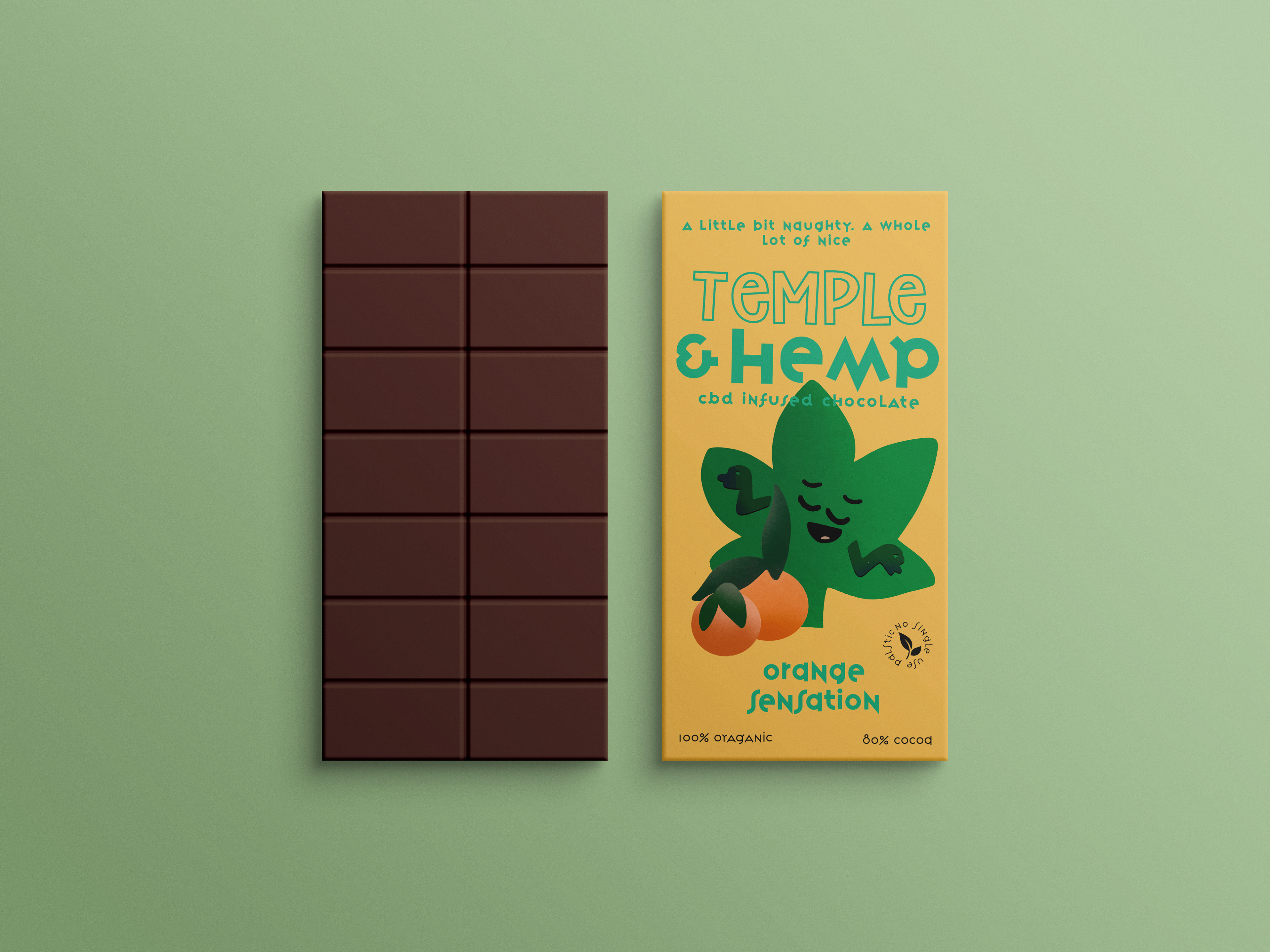
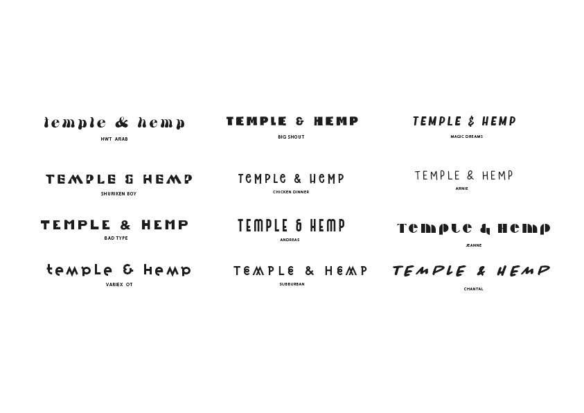
As the client required funky fonts, I explored a few typefaces that I felt were different, but were still legible and easy to read. As these products were intended to be in stores, It was important the the type needed to be clear in order to capture audiences attentions.
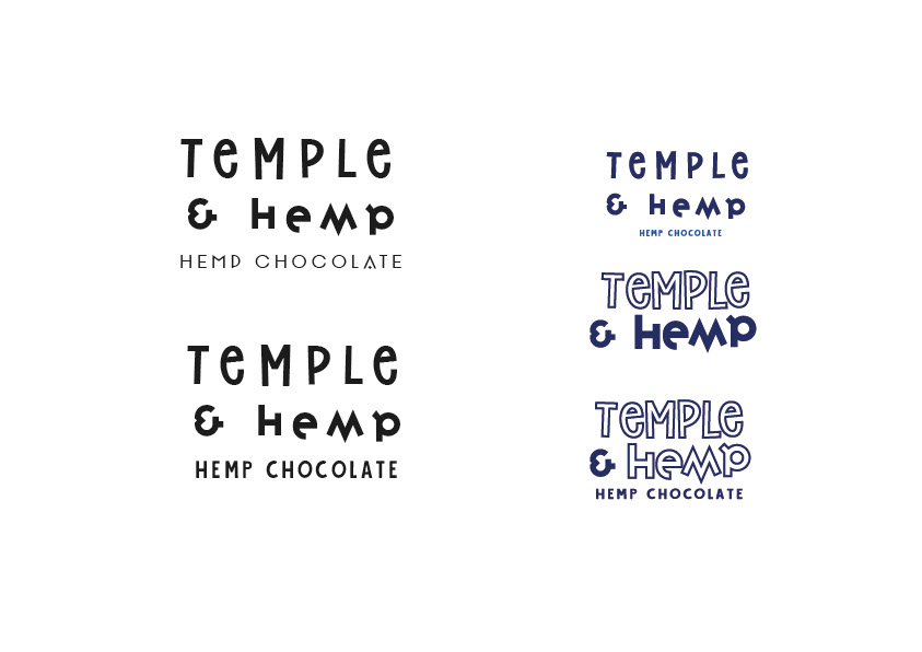
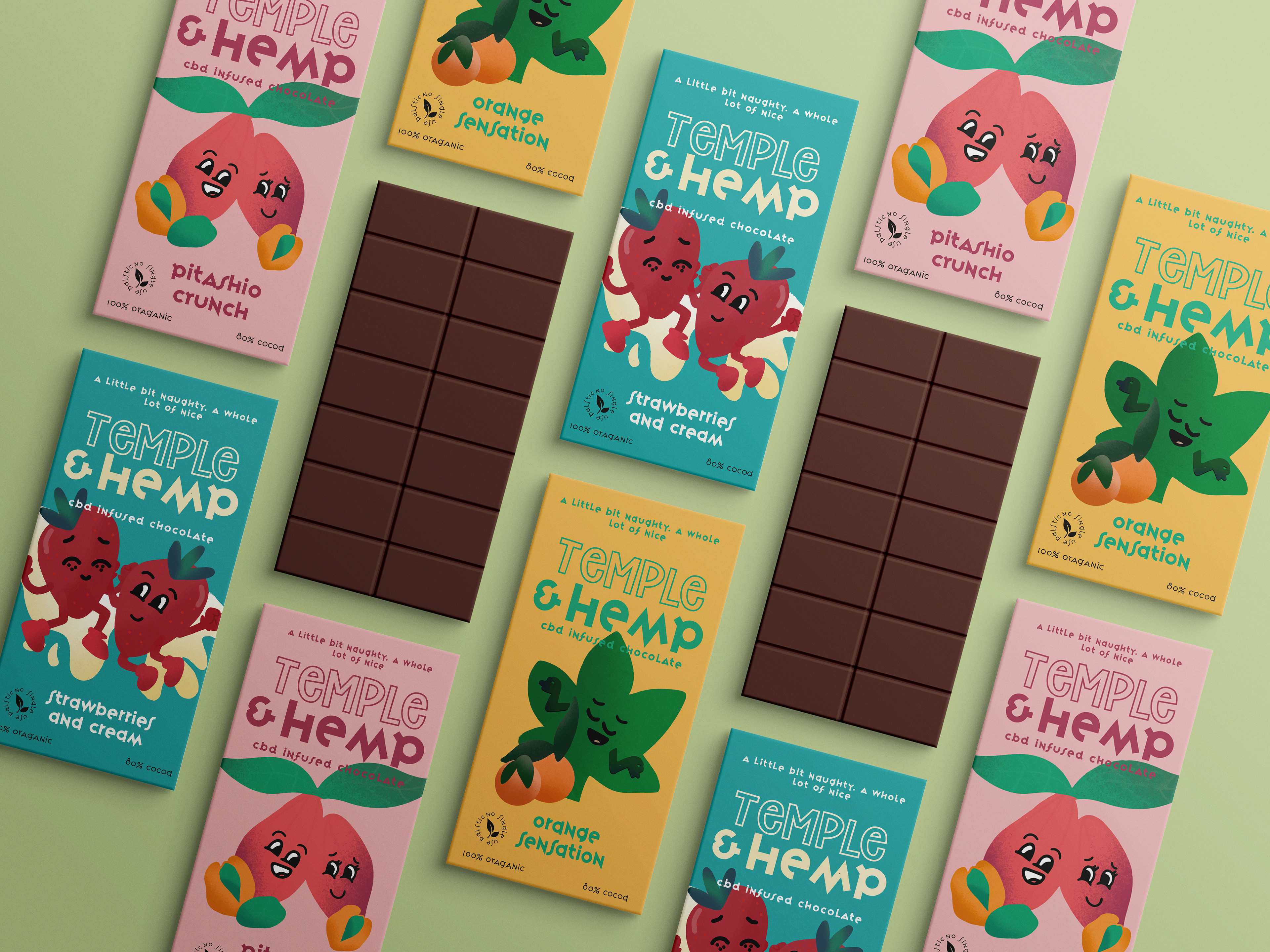
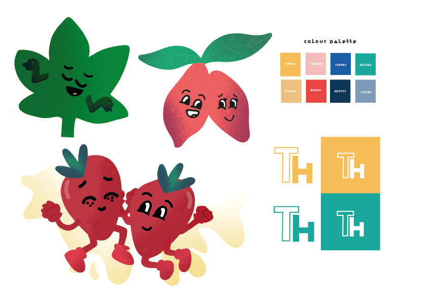
I settled on a type that was structured, yet still had a funky and relevant feel. I explored different layout designs and sizes to see what worked well and what didn't and paired each type with an illustration to explore different styles and arrangements.
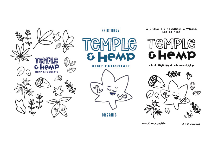
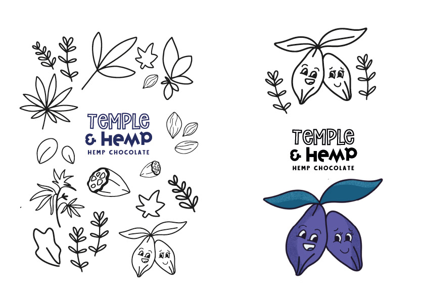
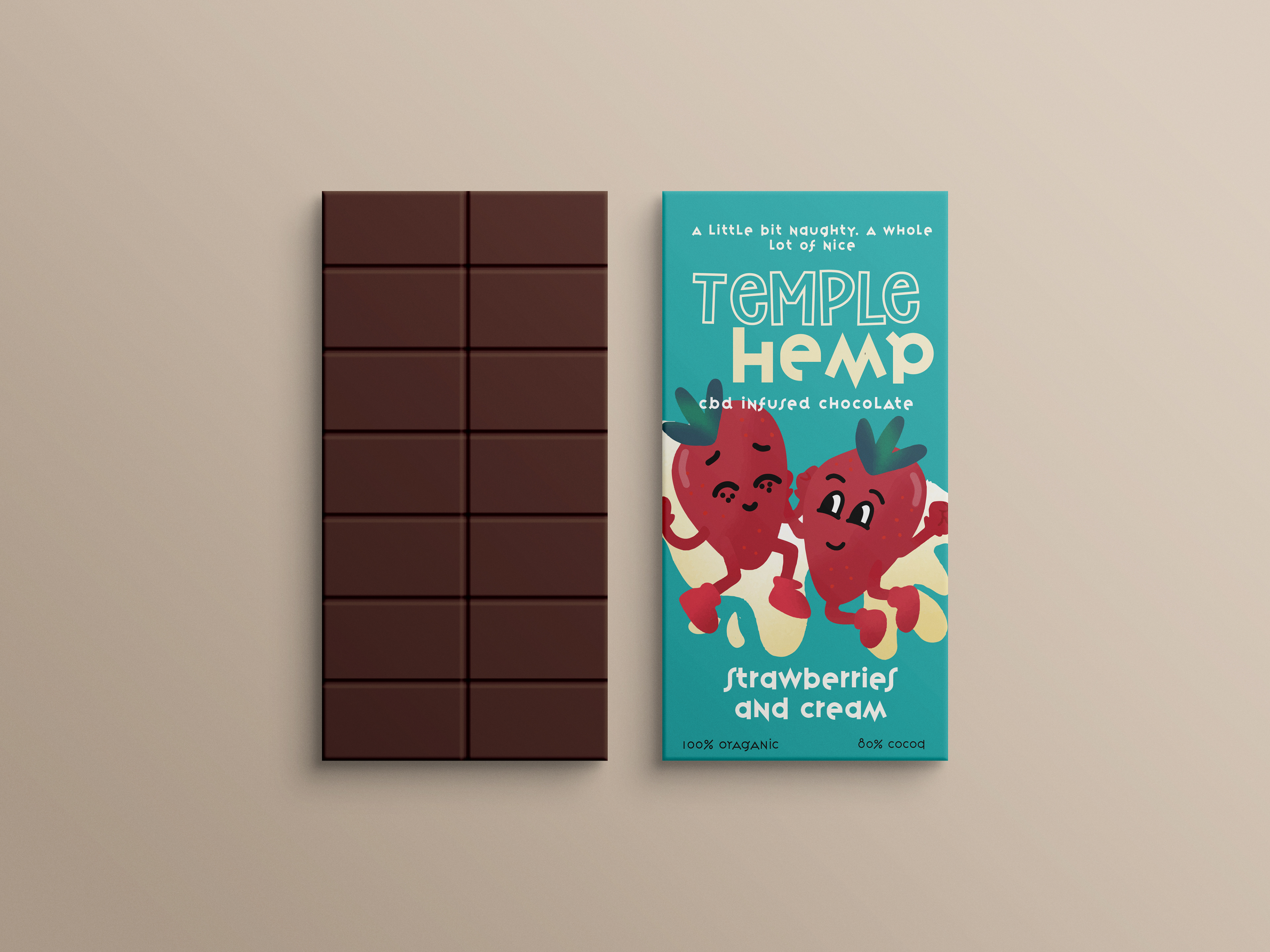
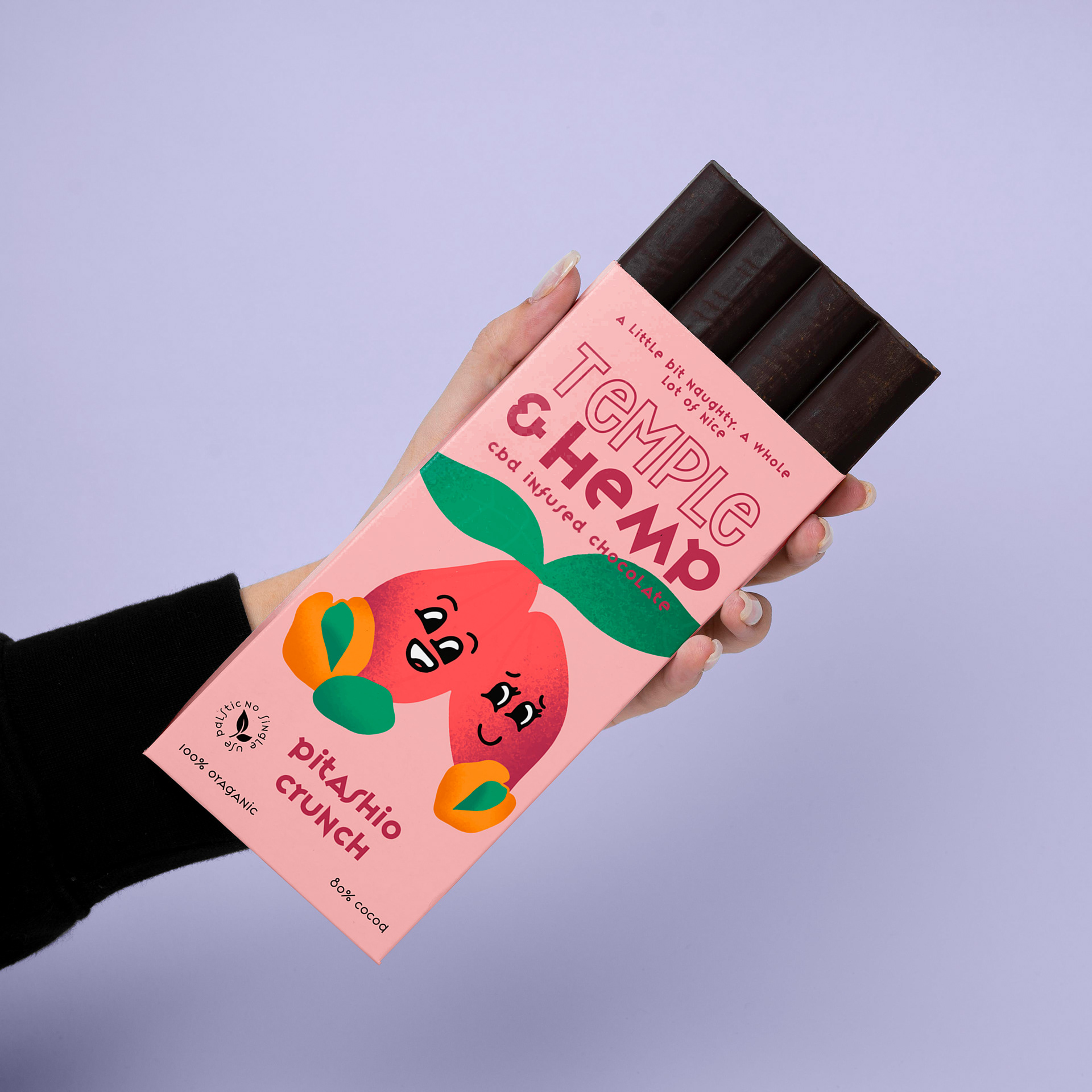
As the client dreamt of having her treats in stores, I wanted to challenge rival brands and communicate something different. Looking at the age demographic of hemp users, it was obvious that the age was anywhere from 18 - 29, so the imagery needed to be mature. However, as the client wanted the designs to be funky and fun, I decided to go with illustrations that were a bit more childlike and expressive. Everyone is a child a heart and chocolate is meant to be enjoyed. Each illustration was representative of either hemp or chocolate. For example, a cocoa bean or a hemp leaf. I also included illustrations that conveyed a different sense or flavour of chocolate, ie, strawberries and cream or pistachio crunch.
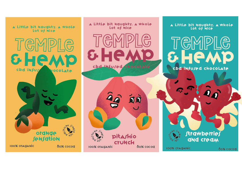
These were the final outcomes. Very fun and funky with something a little different to attract the right audience and allow each chocolate to be easily identifiable.