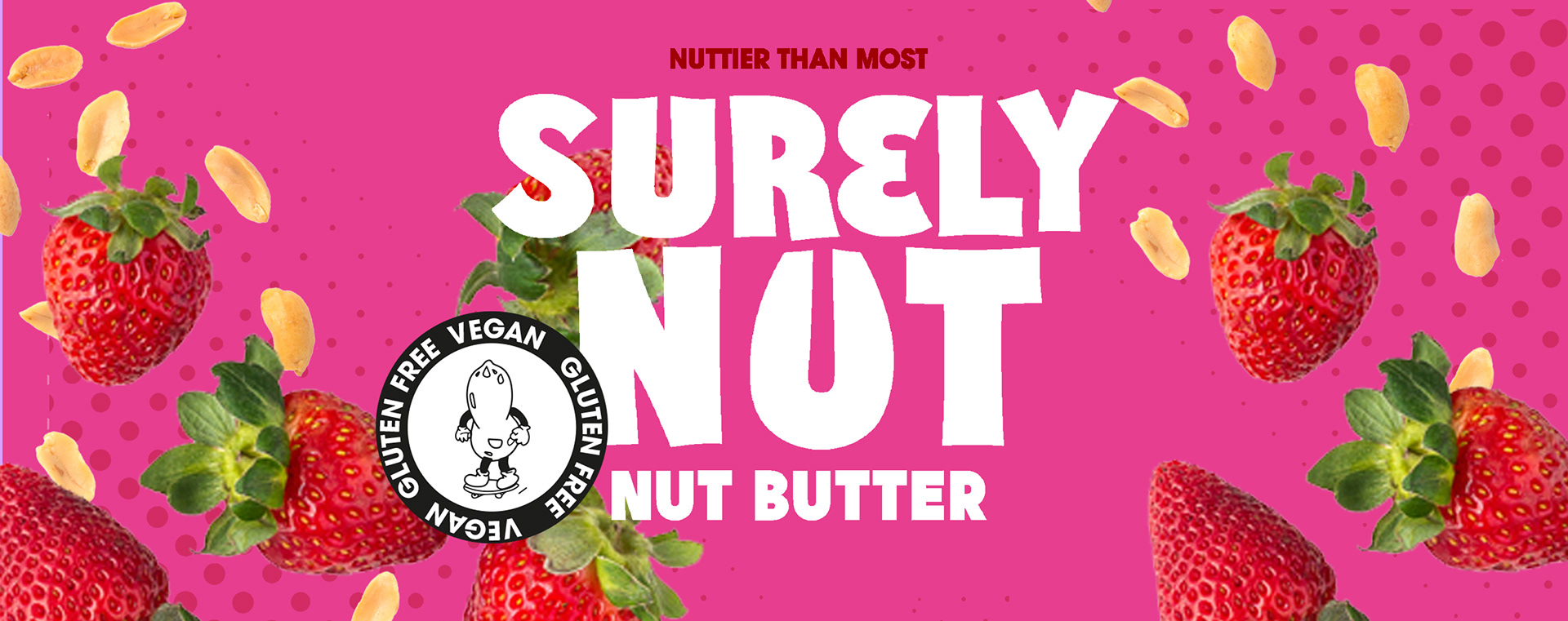
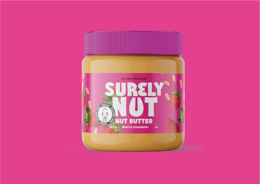
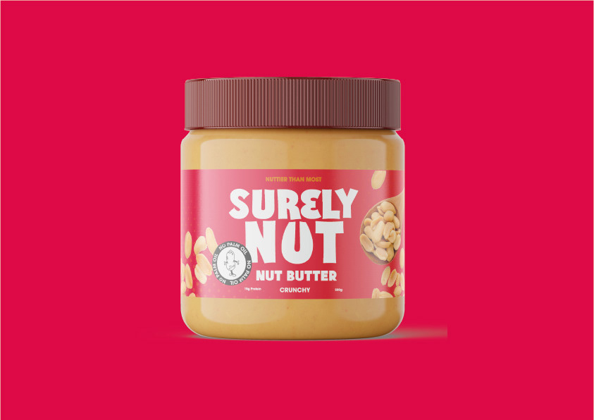
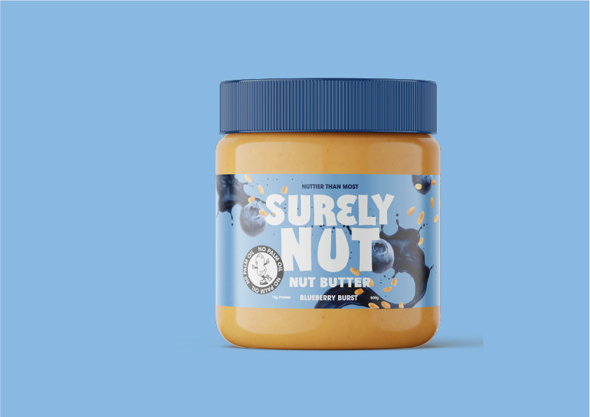
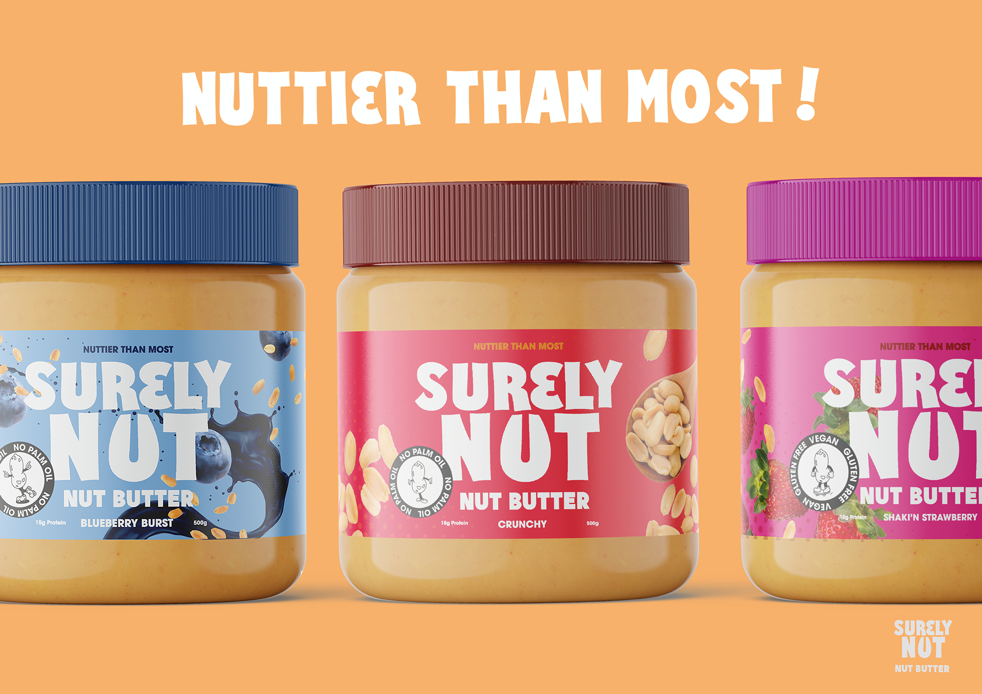
This was a brief for a UK based peanut butter brand known for its unique flavour combinations.
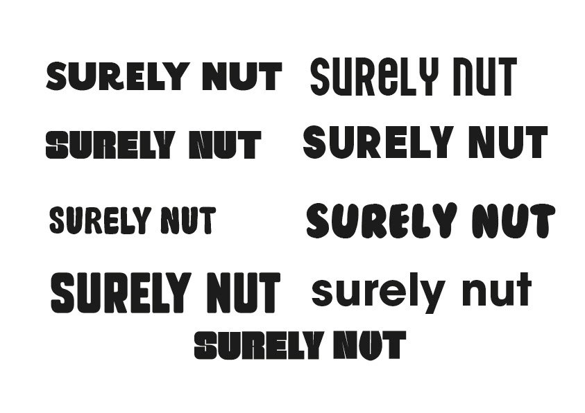
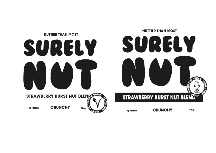
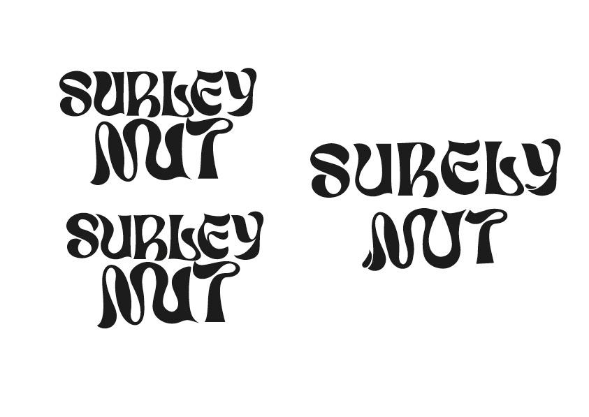
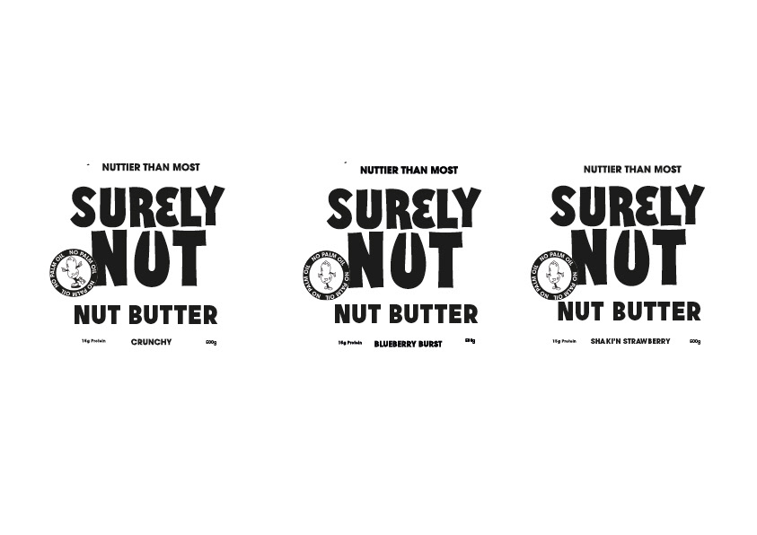
As the name was very individual, I wanted the type to reflect this. I chose a fun but structured font and deconstructed the 'u' in nut to mimic the shape of a peanut. This not only highlighted the uniqueness of the brand but it made the product really stand out against its competitors.
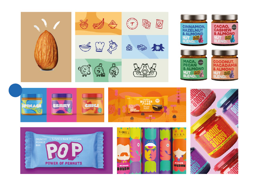
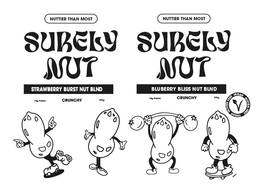
The process boards below really show the undertaking of the brief and how multiple routes were taken. At first I wanted the logo to be free flowing and natural to imitate the swirls of peanut butter but after many attempts, the type wasn't very legible and I didn't think it fit the feel of the brand. I created a couple of icons to go along side the brand to make it feel fun and fresh. Originally I was going to incorporate these into the packaging design but they didn't seem the right fit.
The slogan was 'nuttier than most' to emulate the nutty flavours but also the well known taste of peanut butter.

social media videos